Research Goal
How might we improve the understandability of the model development lifecycle to empower Bloomberg's data analysts?
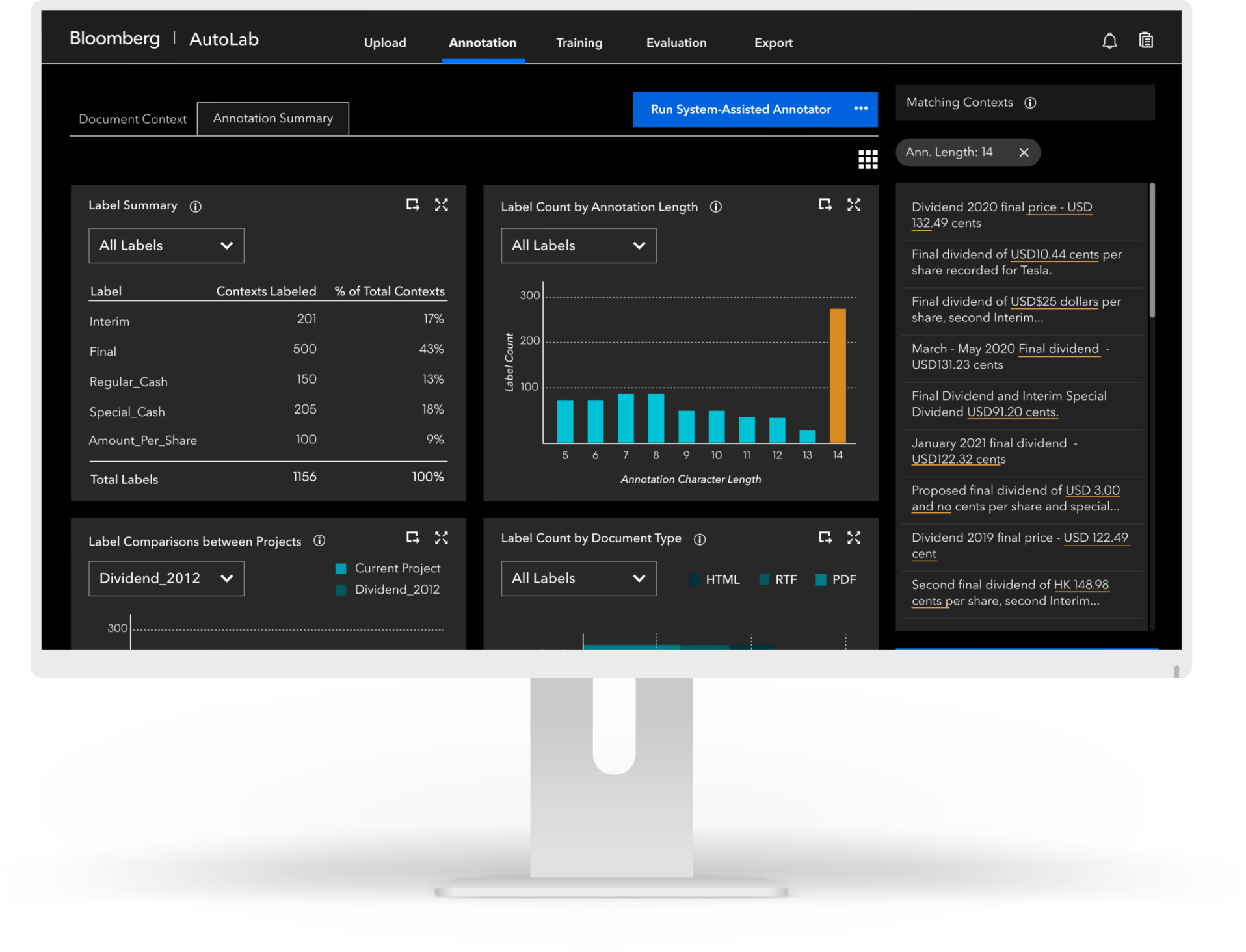
Bloomberg’s Terminal consolidates information across millions of financial documents, with ML models that identify and extract key datapoints.
Business analysts have the domain expertise needed to train the models but lack the technical skills needed to understand the process. Bridging this gap is critical so analysts can systemize their knowledge.
Solution Benefits
Compared to the current model development lifecycle used by analysts, our proposed process offers three core benefits:
It reduces the number of steps in the model-training process by over 25% without tradeoffs in model performance
It improves system understandability by 69% for analysts, so they feel confident moving quickly through the process
It guides analysts through training so they can more easily identify model issues and train more accurate models
My Role
UX Research Lead
I identified major pain points in analysts’ current model-training experience through a variety of research methods.
I collaborated with engineers, product managers, and analysts to test prototype usability through think-alouds, quantitative evaluations, and eye-tracking.
Client
Bloomberg LP
Collaborators
Project Timeline
With remote contextual inquiries, I understood where analysts struggle when building models today, then narrowed down from 30 ideas for improvement to 6 through storyboarding and speed dating. I then led a series of iterative usability tests to refine our ideas into final prototypes.
Discover Analyst Issues
Remote Contextual Inquiries
How is the current model-training experience for analysts?
Bloomberg already had a model-training interface in place – “AutoModeler”. However, analysts struggled to use and understand AutoModeler to build effective models. AutoModeler’s product managers weren’t sure why.
Our team needed to uncover the lived experience of building projects in AutoModeler. We were dealing with two constraints:
1
Even with access to the tool, we couldn’t effectively simulate the range of model-building experiences analysts underwent
2
All analysts were remote due to COVID-19, so we couldn’t sit in on their daily model-building
To address these two constraints, I constructed a remote contextual inquiry method:
SHOW AND TELL INQUIRY:
Analysts share their screen as they run us through their most recently built model and relive their decisions and issues with AutoModeler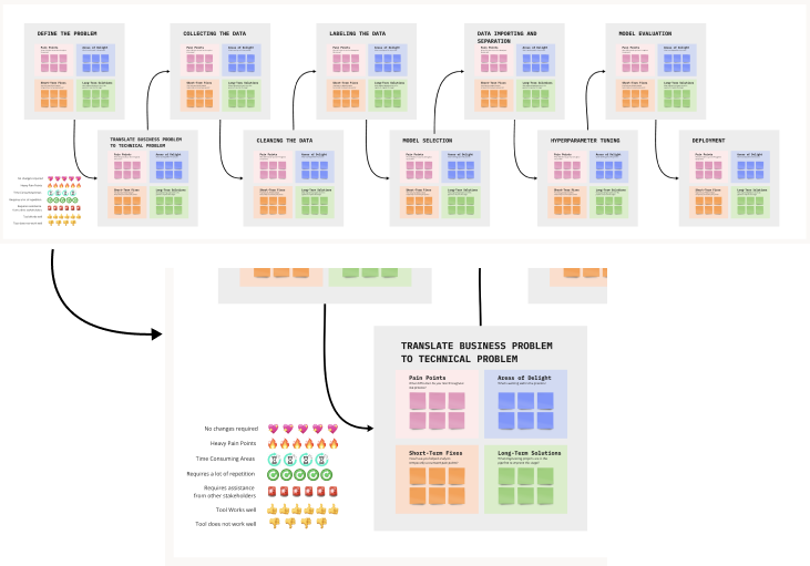
User Journey Map
Where should we focus our attention?
With raw findings from 11 interviews, I suggested a user journey map to map out the problematic parts of the current model-training process, along with the ovearching issues with these stages.
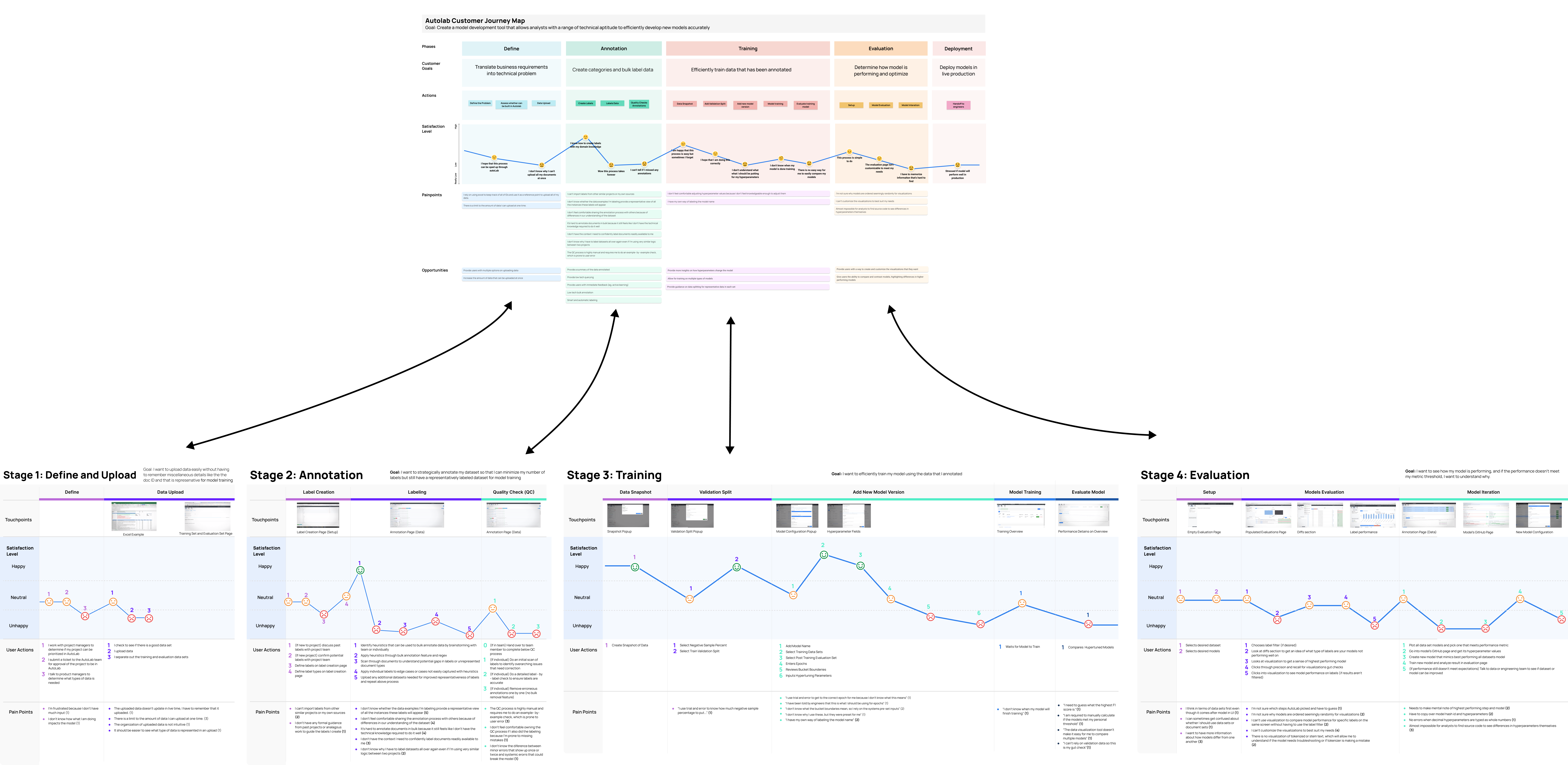
We learned...

Analysts don’t have enough technical / contextual knowledge to identify the ideal next steps in the process

Analysts struggle to find patterns within their data because information is presented at a granular level

Analysts refrain from sharing their workloads because they cannot adequately predict and control others’ inputs

Analysts are inefficient because the system doesn’t remember their preferences or specific needs between projects.
Define an Ideal State
Competitive Testing
What are proven ways of making complex topics understandable?
The overarching insights from our affinity diagram helped the team align on a problem statement going forward:

PROBLEM STATEMENT:
How might we improve the understandability of the model development lifecycle to empower analysts with varying levels of technical proficiency?
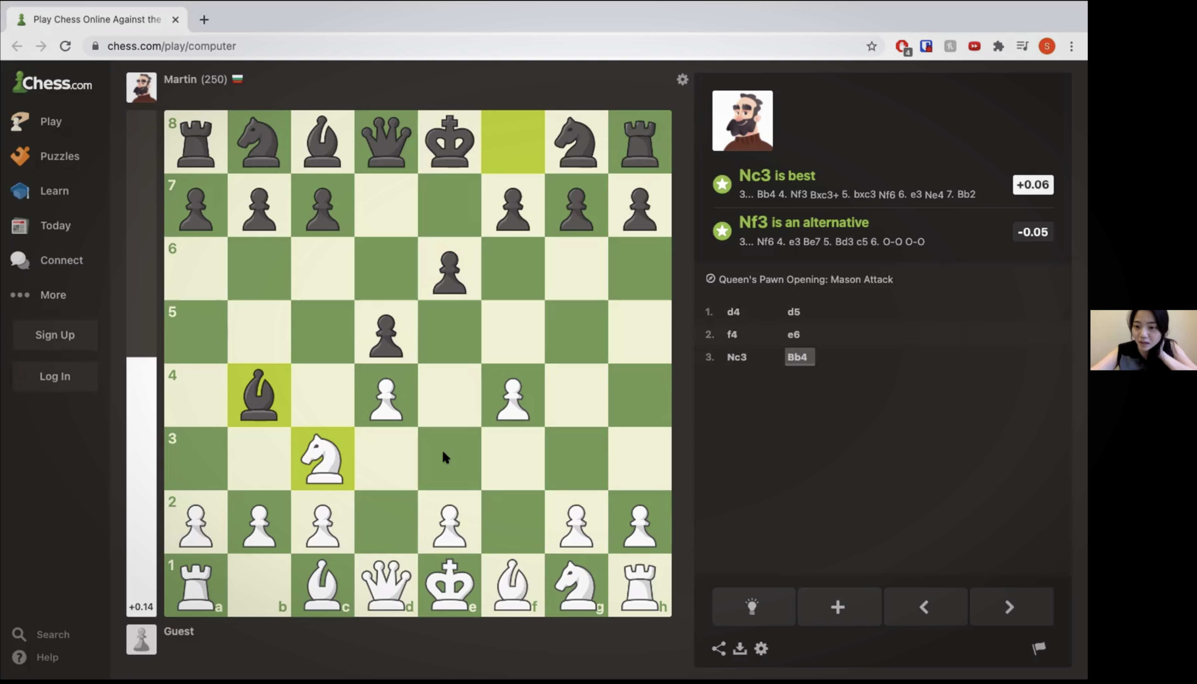
We faced a few constraints in identifying inspiration for improving understandability. I suggested looking to analogous domains as a workaround, focusing on chess.com's ways of making chess digestible for novices.
Participatory Design
How do users define understandability?
Although we knew that understandability was important to users across the model-building process, and we had learned some strategies for improving understandability, we weren’t sure if users wanted the same level of hand-holding and guidance across all stages.
How can design metaphors help?
1
Start by imagining different ways users could interact with the system in a future-state, along various levers
2
Combine complementary ways into a defined relationship illustrated by a clear metaphor
3
Users map their ideal “relationship” with the model at each stage using the easily grasped metaphors (as opposed to abstract concepts)
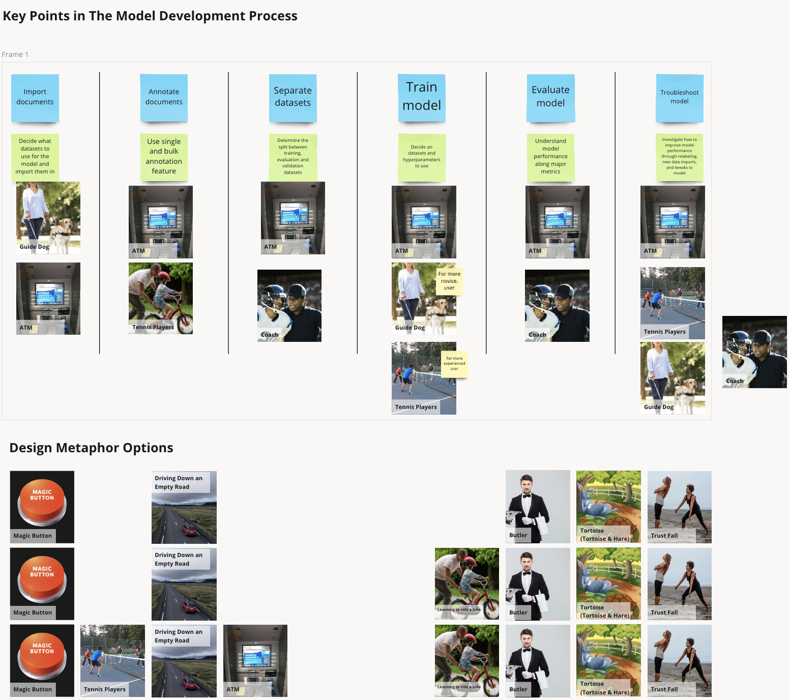
We learned...

Novices have a more effective learning experience when they can work through a problem independently, with constant feedback.

Novices enjoyed receiving machine over human support because it felt less judgmental and “nagging”.

Users wanted drastically different levels of guidance, feedback, and understandability at each phase of the process

Annotation and evaluation were especially confusing; analysts needed disproportionately more guidance and feedback in these stages
Explore Potential Ideas
Evidence-Based Design + Storyboarding + Speed Dating
How could we incorporate our findings to improve AutoModeler?
At the onset of the project, our team had hundreds of ideas to potentially improve AutoModeler. But with the research we had done, we finally had some guardrails on what good ideas looked like.
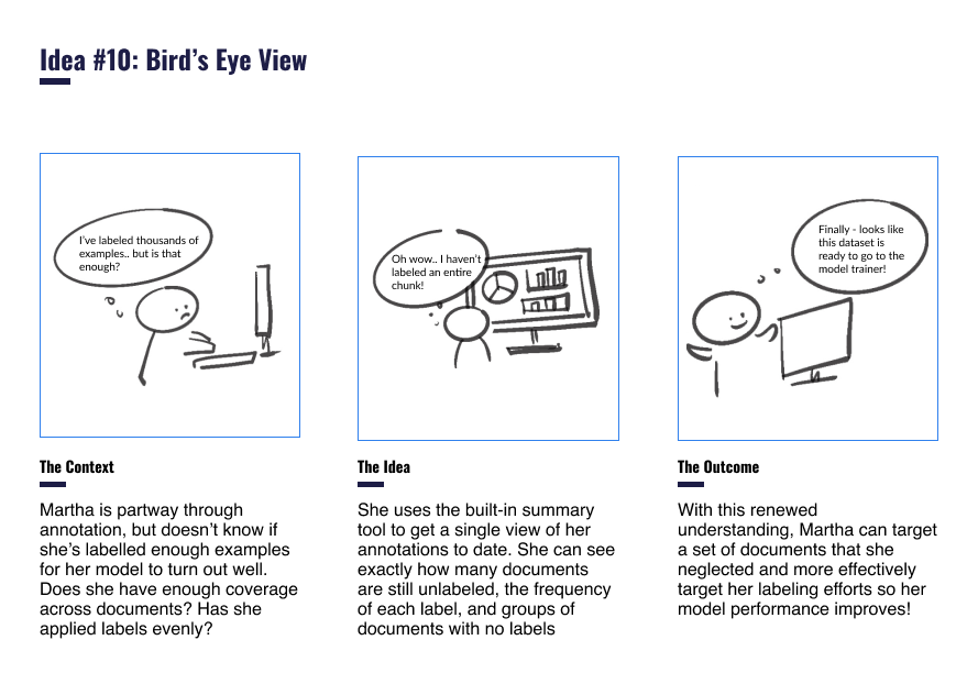
With our learnings in mind, we developed 30 storyboards to represent our ideas across all four model-building phases. We asked users to rank ideas within each phase, and provide qualitative feedback.
Survey Analysis + Design Workshops
How do we prioritize ideas to build out into features?
We mixed session analysis and participatory design sessions to narrow in on 6 high-priority features our team should build out and test:
Speed Dating Analysis:
Method: We had analysts score their likeliness of using each idea on a scale (1-5) and combined this with qualitative feedback.
Rationale: We could identify the most universally liked ideas, and use qualitative feedback to shape them into the best versions of themselves.
Design Workshops:
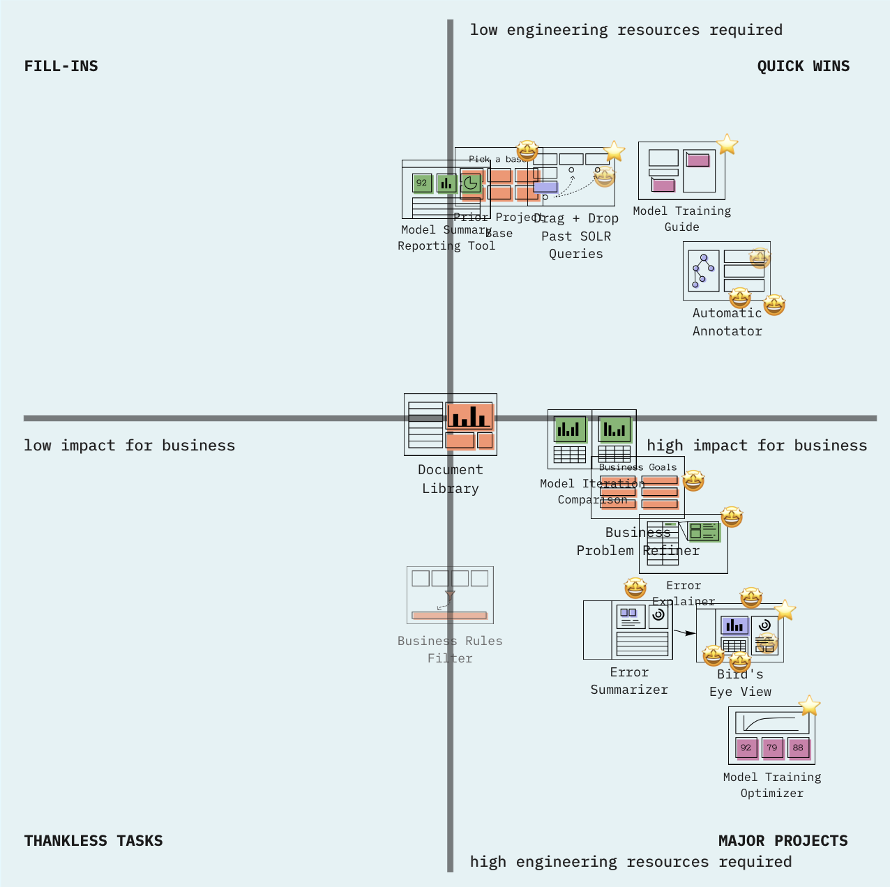
Method: We developed a “business prioritization matrix” for AutoModeler’s engineers and product managers to position prioritized ideas according to their estimated ROI and engineering resources required.
Rationale: We wanted to integrate idea desirability with their business viability and technical feasibility to prioritize ideas that satisfied all of Bloomberg’s goals.
Usability Test Prototypes
Card Sorting
How should we organize AutoModeler’s new proposed features?
Our proposed features required a total redesign of AutoModeler’s model-building process, and a remapping of its information architecture.
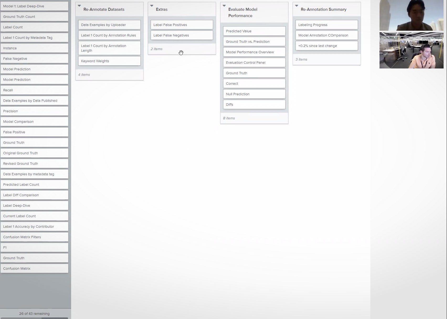
I proposed card sorting as a way to ensure our information architecture would match users’ mental models. We took a two-step process:
1
Determine all the core headers that would be necessary for our new AutoModeler features, along with the major parts of our reimagined model-building process
2
Conduct a closed card sort to identify how analysts sorted these headers and identify discrepancies that could inform our interface organization
Usability Testing + Think-Alouds + Eyetracking
How do we create a process aligned with users’ mental models?
After our team had developed an initial, low-fidelity flow I suggested a three-pronged approach to drive rapid learning and iteration and help us get to a final, high-fidelity flow that met our users’ needs:
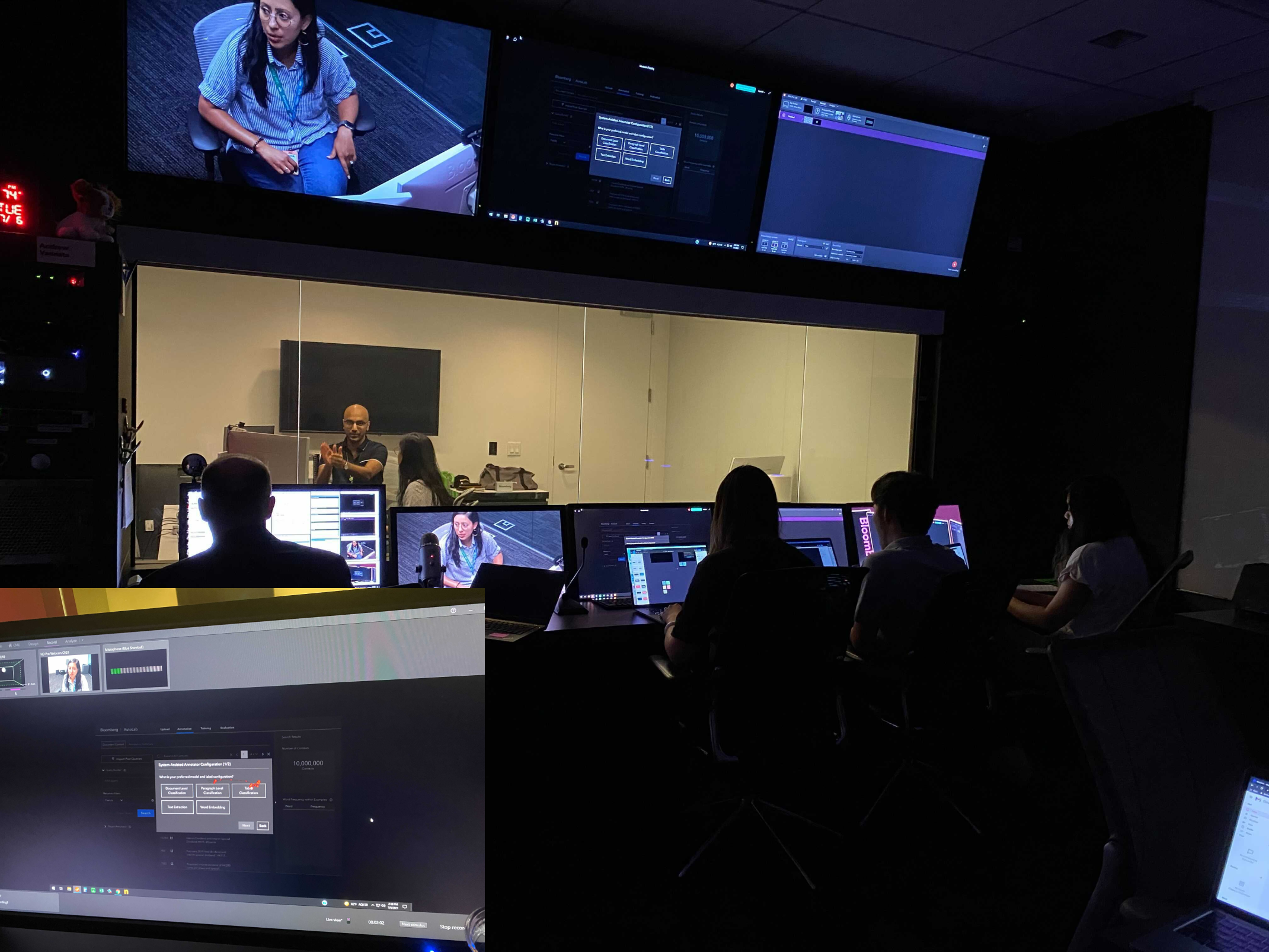
Usability Testing at Increasing Fidelity Levels: We narrowed in on moments of frustration as users worked through model-training flows in our prototypes, iterated to a higher degree of fidelity, then rinsed and repeated until our users had consistently delightful experiences.
System Usability Scale (SUS) Assessments: I suggested that users take a SUS anonymously after each iteration, helping us identify specific areas where we were subpar when users were hesitant to critique us directly.
Eyetracking: Eyetracking technology in Bloomberg's Usabiliy Lab mapped exactly how users scanned our pages, to adapt our screens so users’ eye movements between tasks was minimized.
We learned...

Users wanted to customize the system view meet their specific project needs (e.g., choosing their own visualizations, importing past logic)

Users loved receiving constant guidance on best actions to take, whether through tooltips, live tutorials, or recommended values

Users wanted information available at an instant, but also wanted clear segmentation to prevent confusion and information overload

Users wanted constant feedback to understand when they were done with a task, since diagnosing that on their own was difficult
Final Value Proposition
Training machine learning models is a 4-stage process. I tested and validated complete overhauls to three stages of that process, creating a process that is more understandable for analysts, increases their efficiency, and maximizes overall model performance:

Upload: Tie Data to Project Goals
Review uploaded documents’ composition to quickly identify if they’re representative of the types of documents the model will see in the real world
Organize uploaded files into similar clusters so analysts know exactly where to add in files from when they need more of certain data types
Annotate: Understand Progress to Improve Efficiency
Identify similar document structures to then easily “batch label” with simplified coding logic and save hours of time
Review labels at any time with customizable summary visualizations to identify unlabeled documents and ensure no time is wasted in labeling them
Evaluate: Identify How to Improve Performance
Understand model performance completely with easily customizable visualizations that let analysts pinpoint the areas of interest that matter for their specific project
Find specific problem areas with intuitive searching, flagging, and relabeling functions that make it easy to fix model issues and move to re-training
Results & Final Thoughts
Through our rounds of usability testing, we’ve developed an interface that users find delightful to use, and is 69% more usable than the existing system
Demystifying Machine Learning for Analysts
Our final designs received SUS scores 69% higher than the original AutoModeler system. We have also presented our initial findings to Bloomberg’s engineering, product management and UX design teams with similar levels of enthusiasm.
After finalizing recommendations, we presented our final designs to the broader Bloomberg AutoModeler teams, and handed off our designs to their engineers to build out and implement.

It can take me weeks, and sometimes even months to train my models because of how hard AutoModeler makes things. But with this system, I could see myself finishing up an entire model in a week, and I can’t tell you how much stress that relieves
AutoModeler Analyst

Reduce training time by 25% by significantly cutting down the number of steps in the process
Improve analysts’ understanding of the process and steps to take in ambiguous situations
Incorporate analysts’ knowledge into models better by making it easier to integrate their thought processes into model training
Improve information accuracy of Bloomberg Terminal with more accurate models powering outputs
Reduce engineering dependency, freeing them up to perform more value-additive tasks
Increase employee efficiency, allowing for more models to be trained to further automate Terminal’s information-gathering
